Rebuilding the UX of pre-approved offers screen
My role: Product Designer, covering User Experience, User Interface, UX Research and UX Writing
Technologies used: Figma, Miro and Google Forms
My role: Product Designer, covering User Experience, User Interface, UX Research and UX Writing
Technologies used: Figma, Miro and Google Forms
My role: Product Designer, covering User Experience, User Interface, UX Research and UX Writing
Technologies used: Figma, Miro and Google Forms

Context and challenge
I received from Pagaleve, a pioneering company in Buy Now Pay Later in Brazil, the following challenge: redo the application's image carousel on the App Store and Google Play.
The company's ultimate objectives with this demand were:
1-Increase the number of downloads;
2-Increase first purchase conversion from new downloads made.
Specific objectives
To have a good direction for the best solution, I established that my initial tasks would be:
-
Analyze the image carousel that Pagaleve already had on the App Store and Google Play;
-
Analyze what users who did not know Pagaleve understood about the application, taking into account only viewing the image carousel;
-
Carry out benchmarks against other market players.
Research and track the problem
When analyzing the carousel, some texts could be very direct, but they did not convey the necessary information.
Regarding the 3 application screens in the carousel, even next to the texts, these were not strong enough to communicate effectively, as they were basically random screens. For the message to work, texts and images had to complement each other.
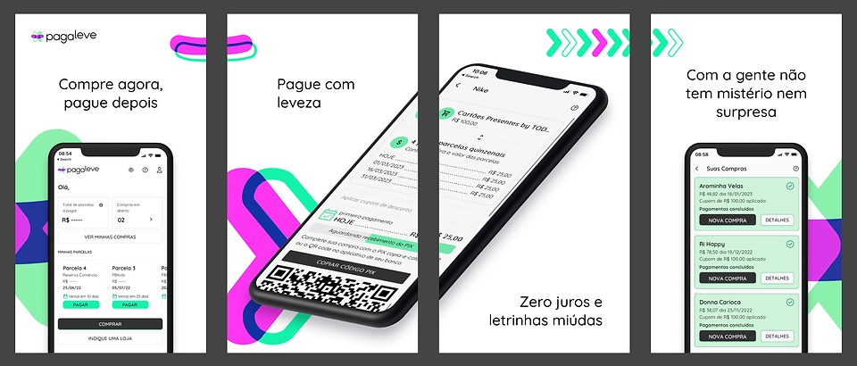
Old layout
Here, I analyzed each text:
1) “Buy now, pay later” referred to a purchase format similar to a credit card, but it is not a credit card;
two) “Pay lightly” communicated something conceptual, but did not convey enough understanding;
3) “Zero interest and fine print” was a text that could be reworked, as it is one of the strong points;
4) “With us there is no mystery or surprise” also did not communicate what was necessary.
To support my arguments, I carried out a quick qualitative research with 6 users who did not know Pagaleve, but who had the same basic characteristics as the main audience: Users aged 24 to 45 who frequently used apps to make purchases.
I asked questions like:
-
How often do you access the app store carousel?
-
Why do you access the carousel?
-
What do you understand about Pagaleve?
-
How would you explain this app to someone else?
5 of 6 users responded thataccess the carousel before downloading any application that they don't know, even if they have received recommendations from other people, so they can have enough information to understand what the application does.
However, the points of attention were in relation to understanding the Pagaleve carousel. The answers (saidwith a tone of frustration and even irritation) that I gathered about were:
-
It must have something to do with a credit card.
-
Is it an e-commerce?
-
How do I make the purchase?
-
How do I pay for these purchases?
-
I don't understand what this app does.
-
I always look at the carousel when I don't know the app, but this one doesn't say much.
Verdict: None could formulate how they would explain it to someone else.
In parallel to the interviews, I benchmarked both competitors (Drip) and other players (iFood and Renner), to understand what their respective carousel communications were like and what could work better for Pagaleve.

Drip's carousel

iFood's carousel
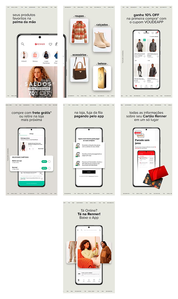
Renner's carousel
The common points of these players, inin particular, were:
-
All texts and images complement each other to strengthen the message.
-
Everyone gets straight to the point regarding what the application does, without going overboard with conceptual explanations.
-
They all provide the main pieces of communication for the user to fluidly fit into the puzzle.
With all of this in hand, there was a story direction that I could recreate.
First draft
In the first version, I tried to keep the texts short, but less conceptual and more instructive.
1) Pay for your purchases via Pix in 4 interest-free installments
Upon entry, the user already has the general context: interest-free installments.
2) Available in more than 500 stores
The user learns that it is an application that can be used in several stores, but not yet how it works.
3) When paying, choose “Pix 4 interest-free installments” or “Pix in installments”
The user knows what they need to do to enter the flow.
4) Pay the first installment and enjoy your purchase
The user knows one of the great benefits, which is receiving the product after paying only the first installment.
5) The remaining installments will be paid fortnightly
In the latter, the user has information on when they will need to pay the next payments.

First draft of the new layout
Although,I still wasn't convinced. Because it was something new and I had my knowledge bias, I needed to carry out a usability test andcheck if communication was clear for users,especially slides 2 and3.
Furthermore, I noticed thatthere was no important part of the narrative: the user would need to go through the website of the chosen store, select the product and only then return to the Pagaleve app. It was something I also decided to check during testing to be sure.
Usability testing
After recruiting 3 more users, the dynamics were as follows:
I showed the first image and asked what the user understood. Then, he showed the second one and asked about understanding again. And so I repeated until the last image, letting users try to fill in the gaps on their own.
After finishing showing the carousel, I asked two more questions: 1) How would you explain to someone what this app does? (the same question I asked in the first round of interviews); 2) Would you like to make any comments?
Users were able to explain what the application did with less difficulty, but some still thought it was a market place. And it was exactly in the second question that one of my concerns appeared:
It was unanimous: None of the users had understood that they would be taken to the store's website and only then return to the app.
There was a loose end and I wasn't giving users the information to tie it up.
In this way, I produced a few more versions, refining images, texts and validating with the Marketing team.
Final solution
To ensure that the new narrative was consistent, I used some Pixar storytelling devices, from “When”, “Then" It is "Until”.
When user enters the app, finds stores for installments via Pix.
Then user accesses the website of the chosen store, selects the product.
Until choose the Pagaleve Pix payment, pay the first installment and receive the product.
Here's what the carousel slides looked like in text (below, the complete sequence of images):
-
Image 1- In the app you will find stores to pay in installments via Pix 4 interest-free installments
-
Image 2 - After accessing the website of the chosen store, select your products
-
Image 3 - In the payment method, choose “Pix 4 interest-free” from Pagaleve
-
Image 4 - Pay the first installment immediately and the rest every 15 days
-
Image 5 - We will notify you close to the due date of the remaining installments
-
Image 6 - Using the app, you can make paying for your purchases easier
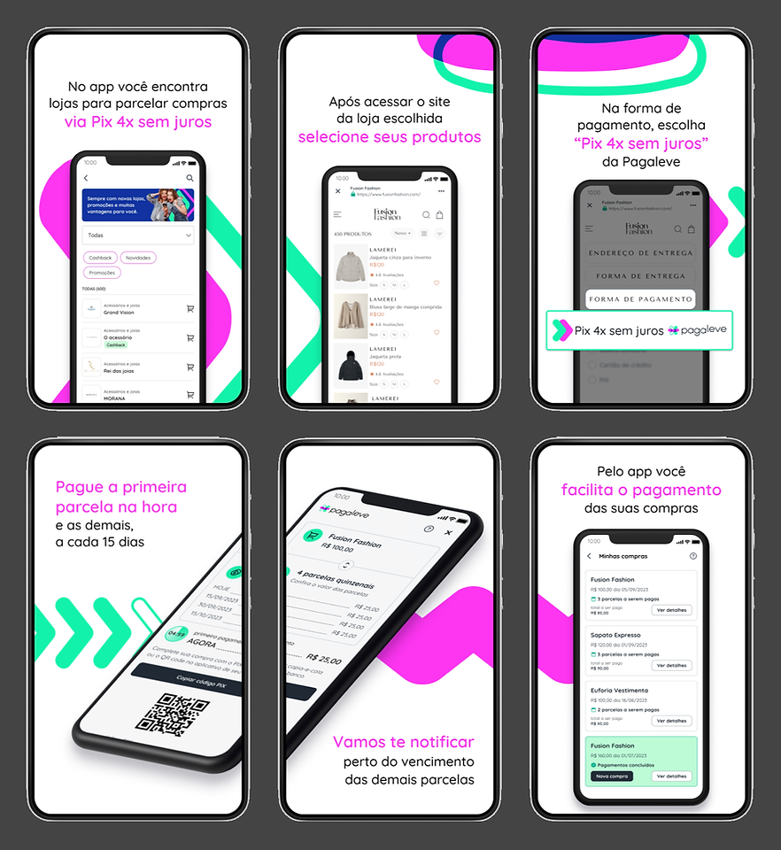
New carousel layout
In this final stage, I carried out another round of tests, this time with 4 users, to ensure the effectiveness of the new carousel. When asked what they understood from the sequence of images and what Pagaleve did, these were the answers:
-
It is a payment intermediary between the consumer and stores. Pagaleve has partnerships with stores and manages Pix in installments without stores having to worry.
-
It's an app that, when I make a purchase in one of the stores, I can choose to pay in interest-free installments via Pix. I pay the first one immediately and others later.
-
It's an app that I can use to pay for purchases via Pix in installments and track my purchase history in this way.
-
It's a type of intermediary so I can pay in Pix in interest-free installments and also see what I bought.
Yes, carousel validated! However, there was still an outstanding issue: measuring the results of the changes.
Results and learnings
Two months after implementation, I needed to analyze the number of downloads and the first purchase rate from these new downloads. I compared these months with the previous two months.
Here, something is worth highlighting:the Marketing team did not carry out any engagement actions to install the application or publicity in general involving B2C.
There were also no dates like Black Friday or Christmas. The comparisons were between July and August with September and October.
Therefore, the results obtained, in principle, represent the effectiveness of the new carousel.
• The number of installations in theGoogle Play increased by 8% It is,in the App Store, 4%;
• As forfirst purchase conversion from these downloads, thisincreased by 1.5%.
After the end of this project, I realize that my biggest evolution process was in relation to competitor research, as benchmarking is one of my biggest challenges. But as I have a more analytical profile, this stage was lighter and more fluid than I imagined. Either way, it's something that requires constant practice and I'm happy to have evolved, as well as contributing to good results for Pagaleve.
So, what do you think? Would you like to make contact? Send me an email atdanielrenatino@gmail.com or write to me at LinkedIn.